HasOffers Trends Report
HasOffers is a platform for advertising networks, who run an advertiser's "offer" with their publishing partners, or affiliates. Networks make money on the brokering between the advertiser and their publishers, and short timelines or short consumer interests means things are constantly changing. They need to keep up in order to keep profitable.
The Problems
- Understanding how traffic is flowing
- Optimizing to reduce fraud and increase profit
- Reporting is difficult to understand the whole picture without a lot of external context
- Patterns change daily, so frequent exploration is necessary
Current Solution
- Export data over multiple days in different slices
- Create spreadsheets in Excel or import into a custom BI system
Our Goal
- Provide customers a way to analyze trends within the app to reduce complexity, empower smaller or less advanced organizations, and save our customers time
Proof of Concept
- A few of use came together from product, UX, and research backgrounds to come up with ideas to design and test with our users
- Had different ideas we wanted to test, but wanted to keep users from getting into comparison mode
- Initially tested ideas independently, but later combined and continued to refine the test to get more thorough feedback from each participant
Initial Design
We first worked on an approach of displaying different slices of the data at the same time in a quadrant view.
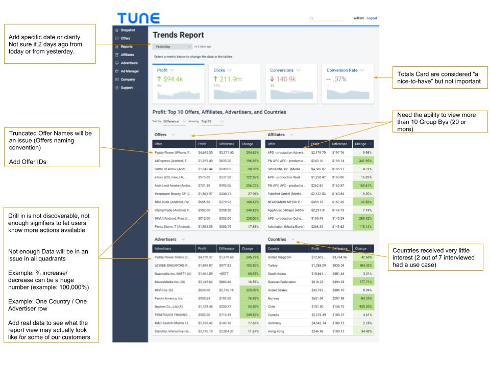
We wanted to test this with users, but we had some concerns over the density of the data and the reduced space for information like the full offer name, which are typically long, and the offer id, which is often used for disambiguation.
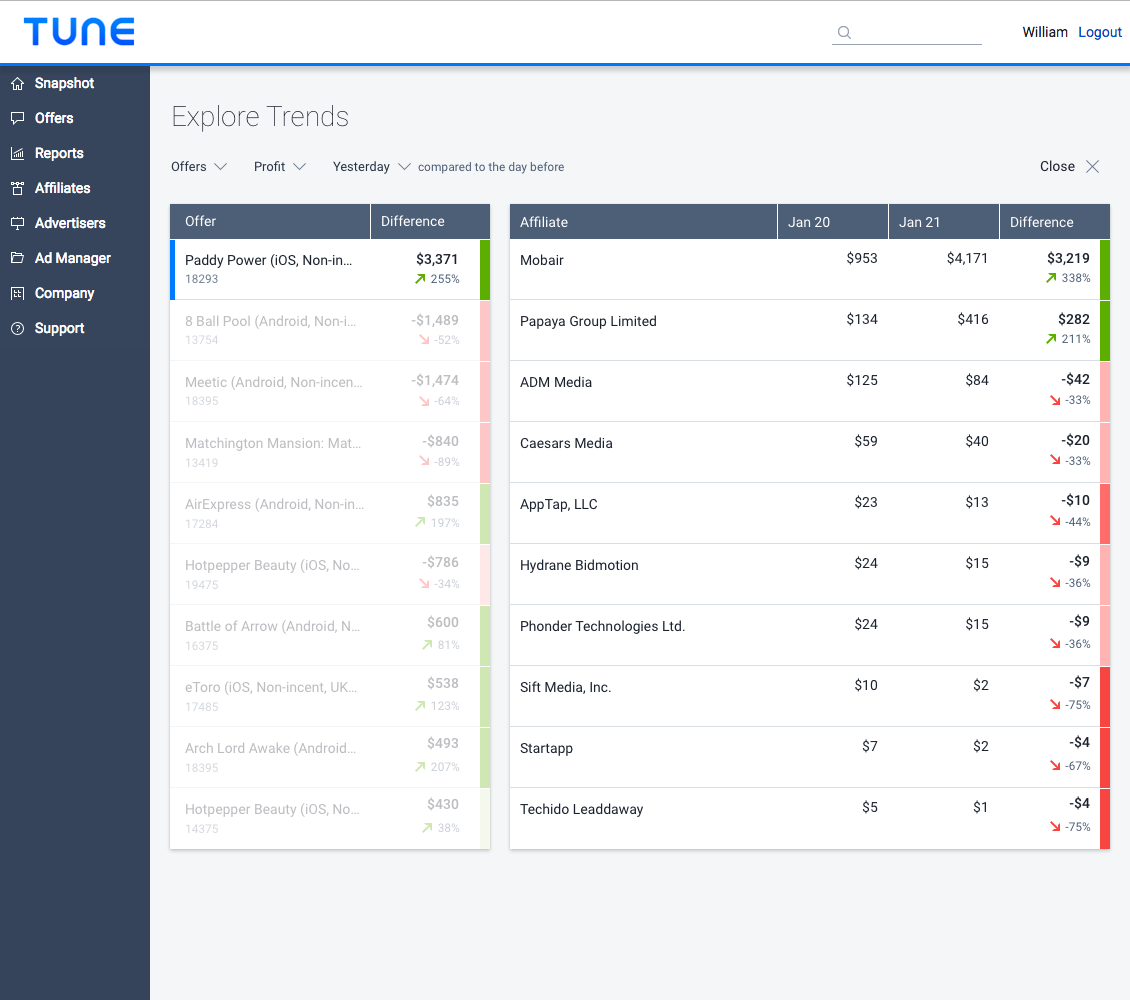
List View Design
We started working on another presentation. We liked that this enabled the option to further explore whatever stood out the most, without having to dig into each slice of the data individually. One issue was the space available for display, and since we were looking at trends, I wanted to show a graphical representation of the data over time. I started working on a tile version to address this.
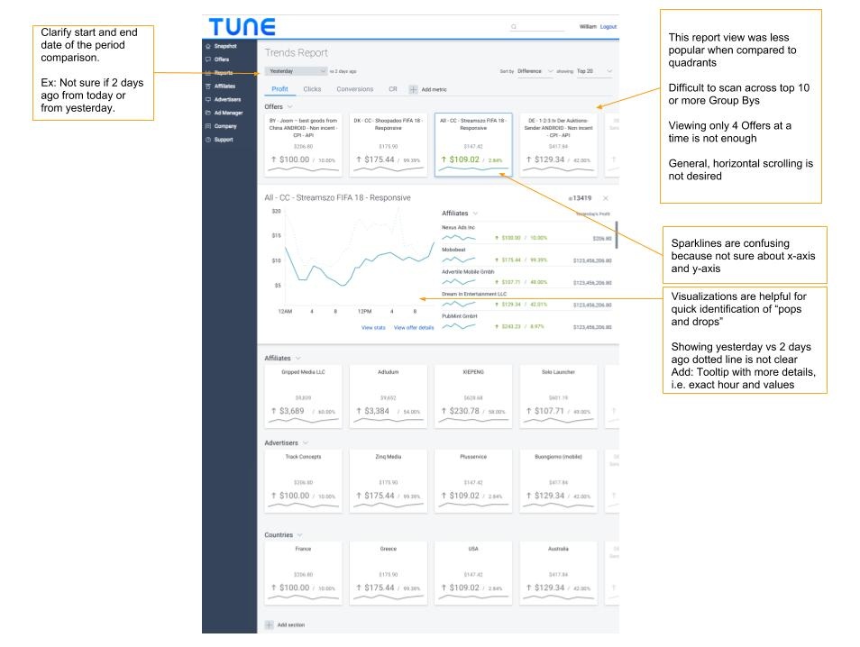
This provided the ability to dig-in to detail on a tile you were interested in, but didn't leave much space to show too many tiles in the view at a time. This view would surface the largest change in each dimension, so I was interested in testing a mixed list of all dimensions, sorted by the biggest change to allow the user to see what had the largest impact on their profit.
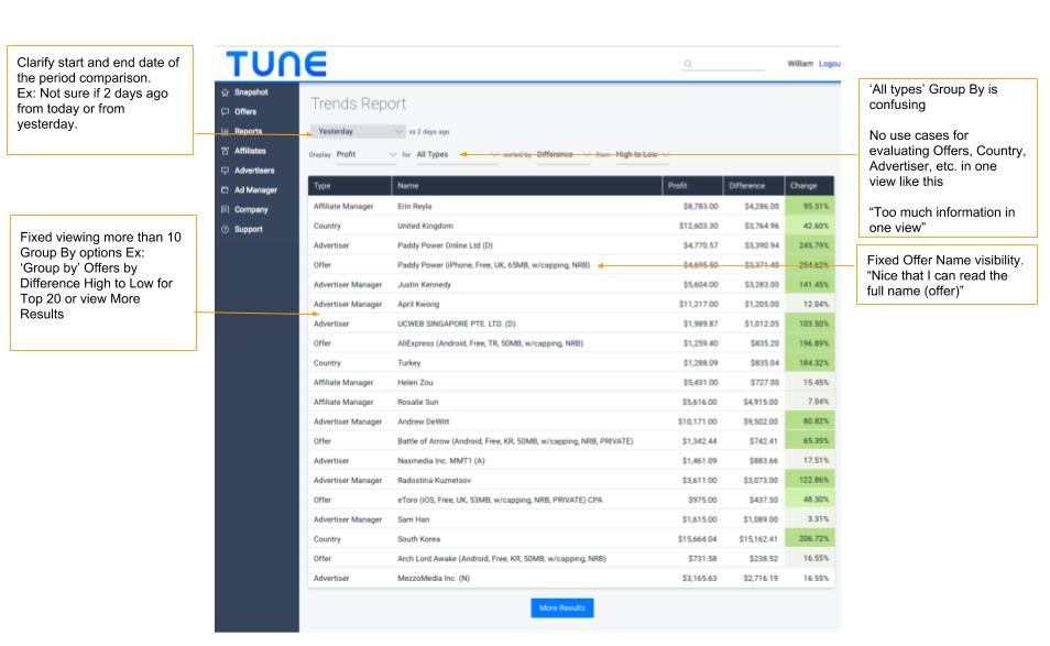
Users found that didn't line up with the way they thought about their data. They did however like how easy it was to understand the data when focusing on one slice, so we split it back into a single dimension at a time.
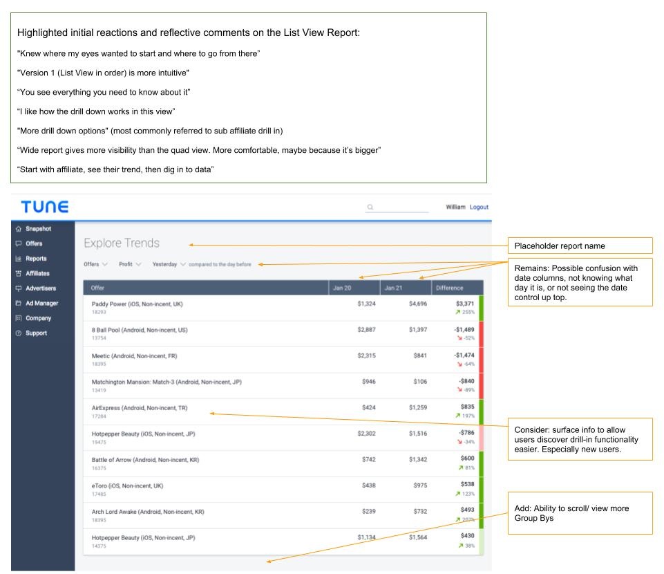
All of us thought the inline drill-down (visible in List View V1) was a great solution, but users found it limiting. They could only see a fixed number of items, and even with thinking about paging, they were overwhelmed with the amount of data presented. We worked on an alternate form of drill-down that simplified the complexity of the data in view and it tested well with our remaining customers.
Quotes
“Knew where my eyes wanted to start and where to go from there”
“The List View is more intuitive”
“You see everything you need to know about it”
“I like how the drill down works in this view”
“Wide report gives more visibility than the quad view. More comfortable, maybe because it’s bigger”
“Start with affiliate, see their trend, then dig into data”