HasOffers Theme Customization
HasOffers (by TUNE) included about a dozen themes customers could select, as well as support for heavy custom modification. These themes were a bit outdated and customers were asking for something more modern. The site was also written on a framework that doesn't support modern development standards and made it difficult for us as a product team to continue to design features that solved today's problems. Our new development platform rendered substantially different html that couldn’t apply the legacy themes and customizations.
Problem
We needed to migrate all customers to a standard look, while understanding and respecting brand customization wherever possible.
The legacy themes offered over 30 individual colors that could be customized.
Research
I wanted to understand how the 30 individual colors were being used, to determine how many accent colors we should support and how best to apply them to our design system. I built a script that generated a tabular visualization of all customers with any customizations.
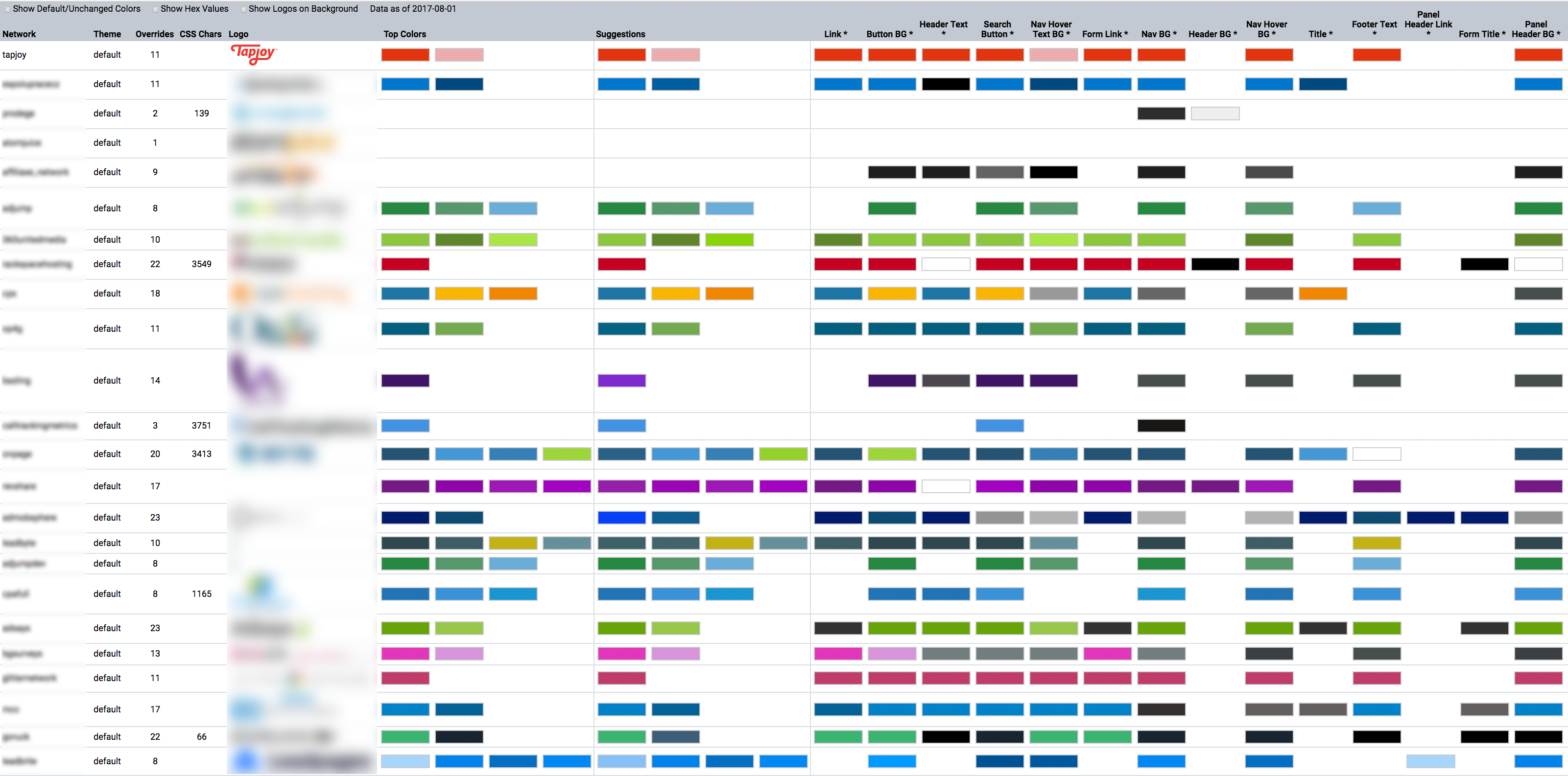
This identified that most customers were using a compact palette and customizing the same settings. I proposed that one accent color would provide an acceptable level of suggested customization without excessive confusion or unsightly combinations.
Initial Ideas
I was working closely with marketing on the communication plan, but felt it was important to signal in the platform that the look and feel change was coming and provide some encouragement to make the change as soon as possible.
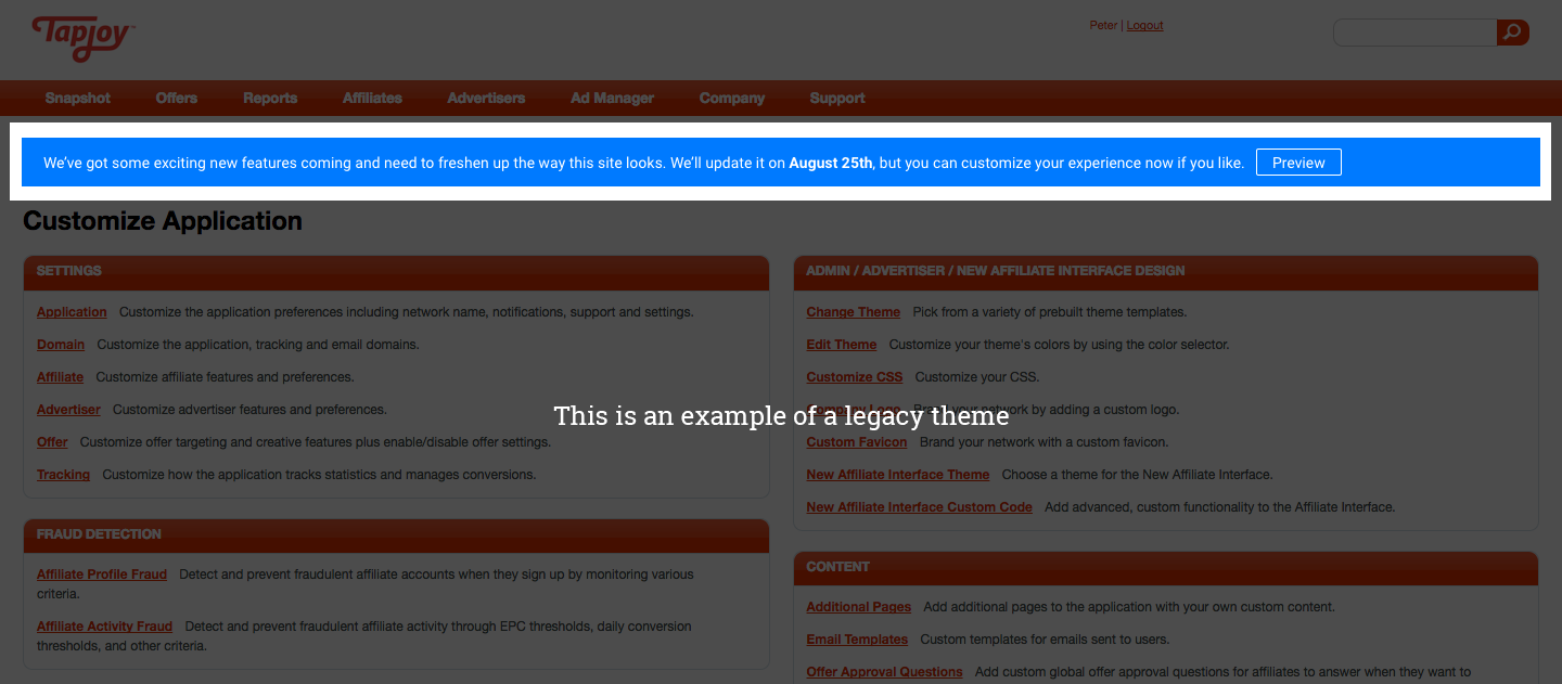
The idea behind the "Preview" button in the banner was to let people play around with a visual example of what their new site would look like before committing to the change.
I came up with a few ideas of the flow to discuss with the engineer working on the update. The first was a simple static page that showed a representation of a typical page using the new theme and selected accent color.
This would have worked, but the whole "Sample Page" example felt forced and slightly confusing. Also, to allow the user to navigate to other pages while in preview mode, they would have to navigate back and forth to the customization page to make another update.
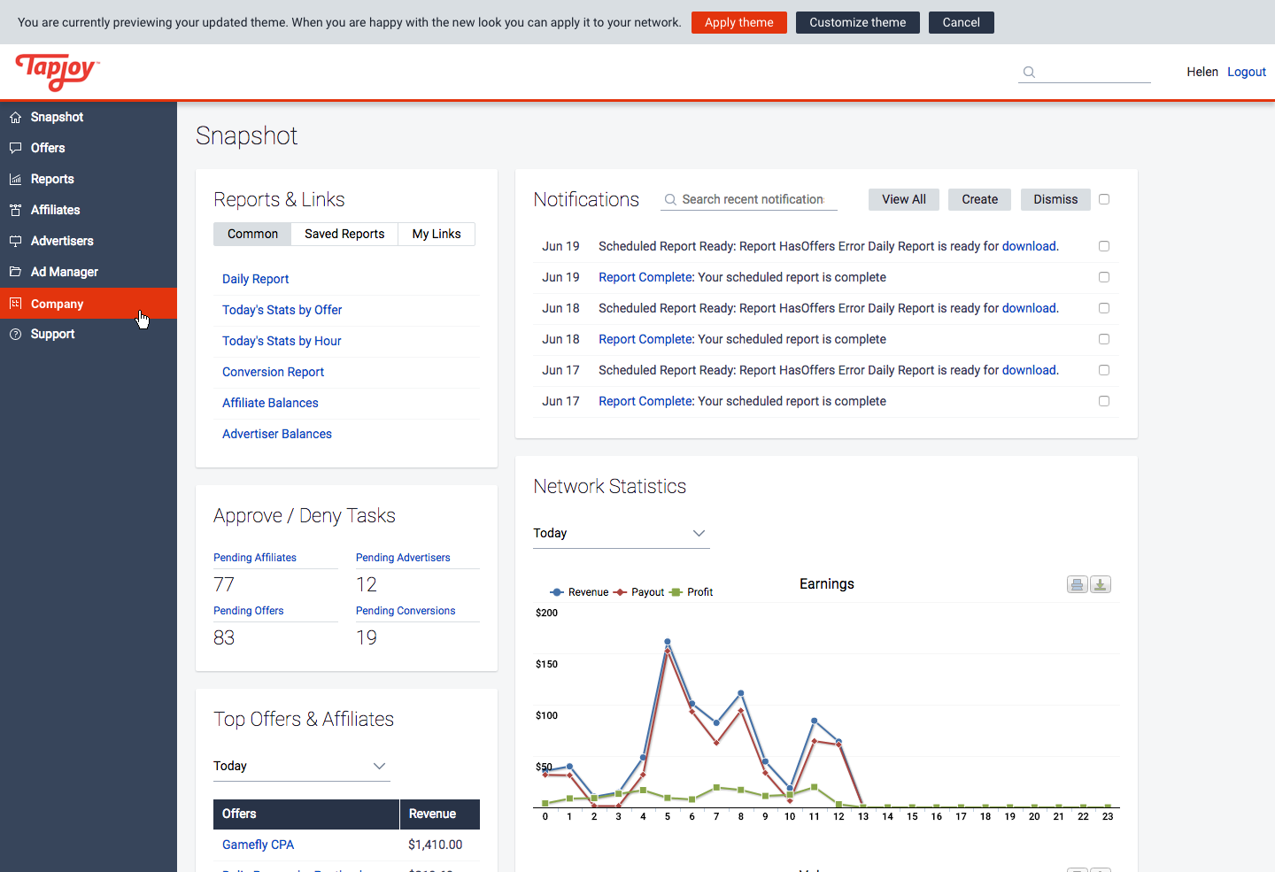
I thought it would be great if people could explore the app while in a preview mode, so they could see how the new style looked on different pages.
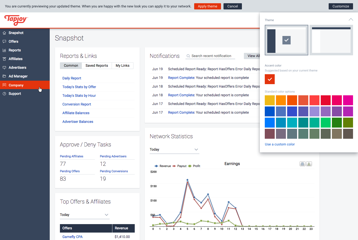
I first tried a flyout menu that would be anchored to a new preview banner at the top of the window. This provided an unobstructed view of the page and allowed the user to navigate through the app, but didn't encourage exploration as the controls were always hidden away.
Final Solution
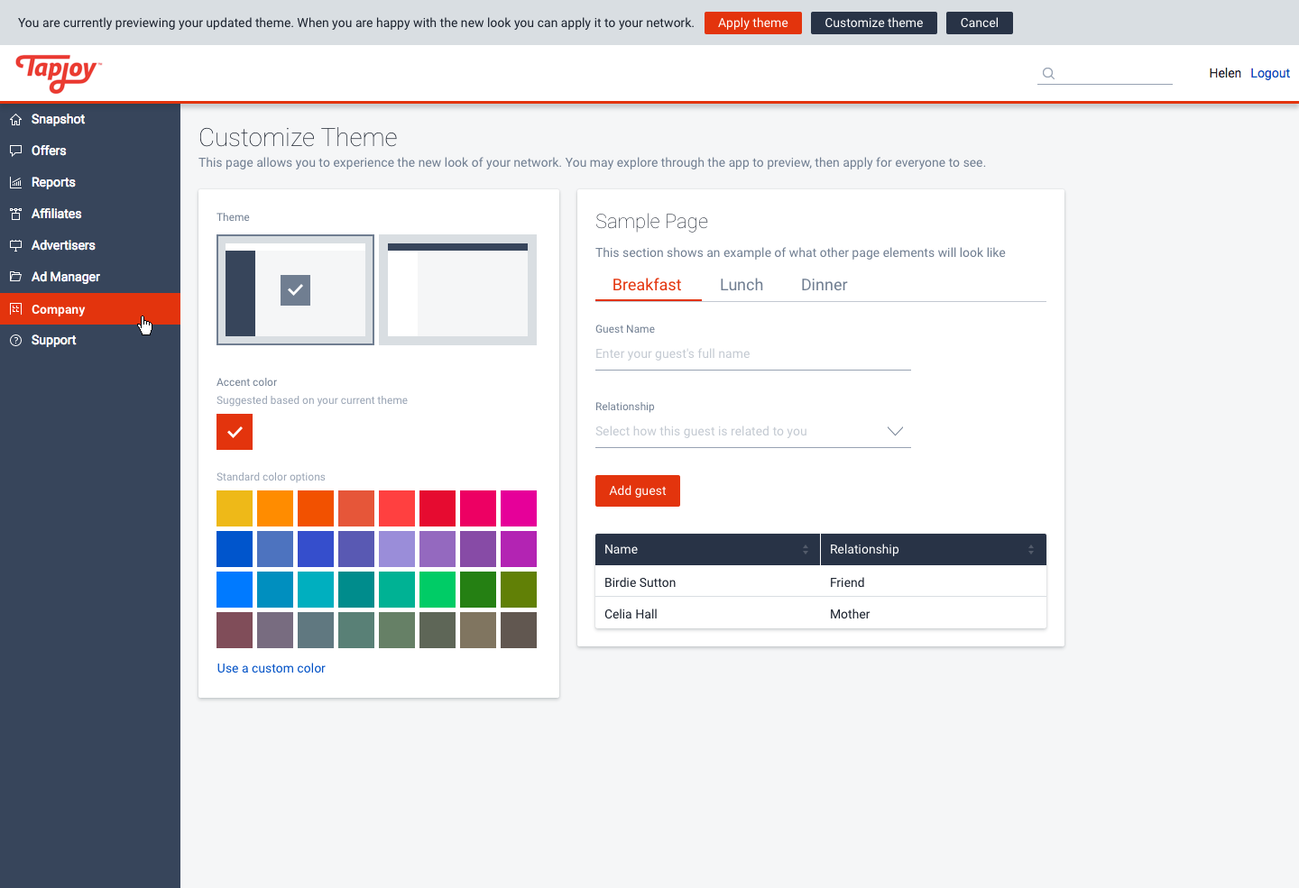
I tried a drawer as a more compact alternative that also helped to separate the actual page content from the theme controls.
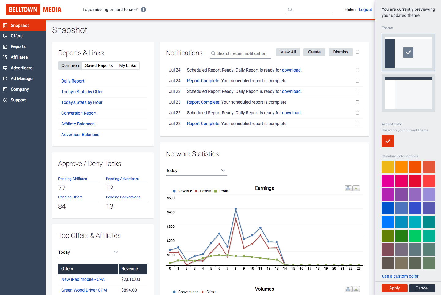
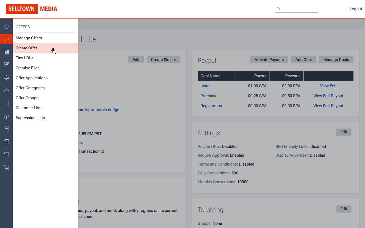
One of the main customizations our customers make is providing a brand logo for the top left corner. In some cases, this is a transparent png that is white or light and wouldn't show up on the new default light header. Since they could previously customize the header, I offered an option to flip the header and menu colors, and added a message next to the logo to encourage people to notice if the logo was showing correctly or not.
Accent Colors
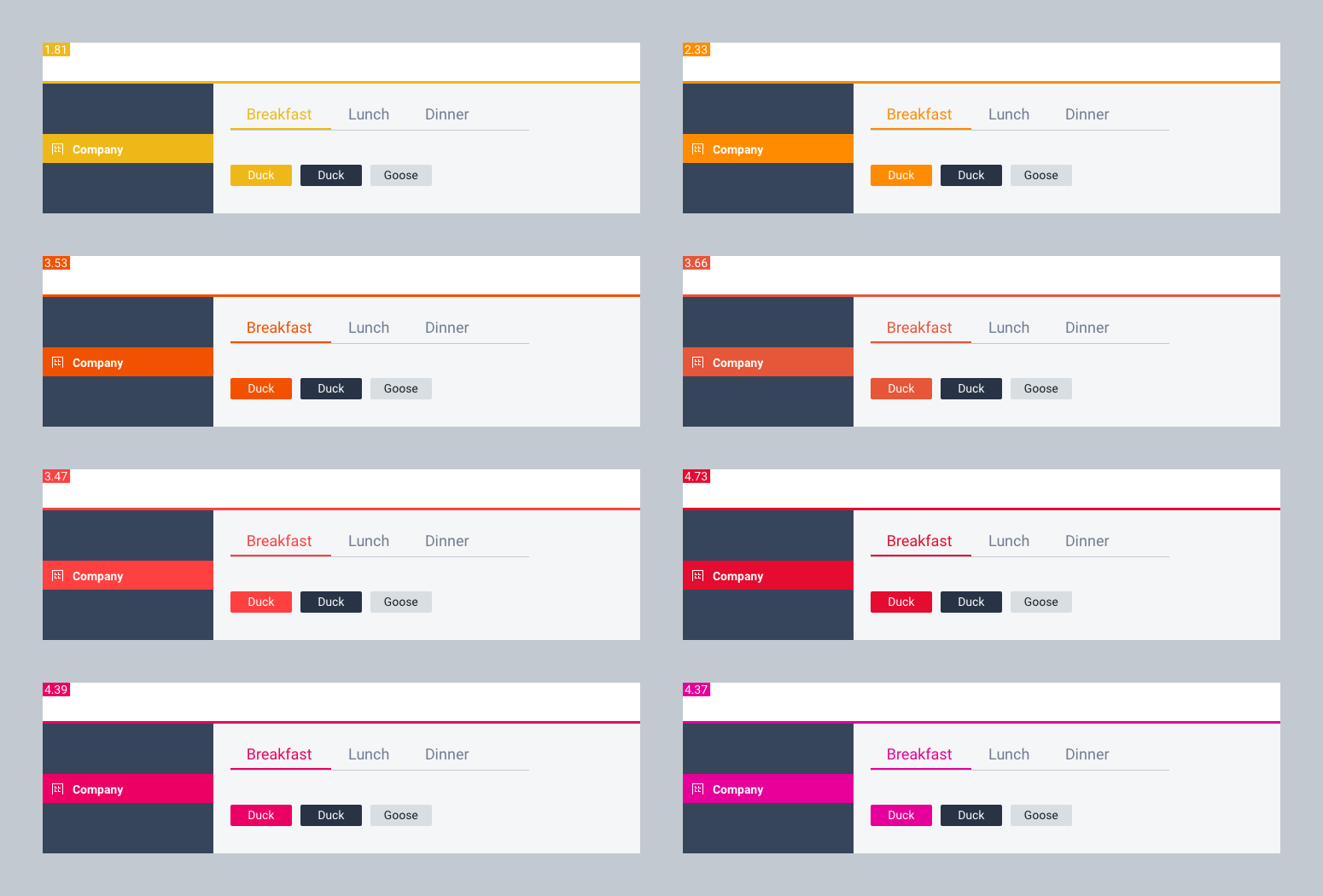
I did a lot of work in developing our new accent color palette to evaluate contrast and test the colors in our modern visual design. Ultimately, I included some colors that were below recommendations to support customers who wanted to decide that tradeoff for themselves. Yellow is the lowest, but I tweaked it until it tested well enough to offer if someone really wanted to use it.
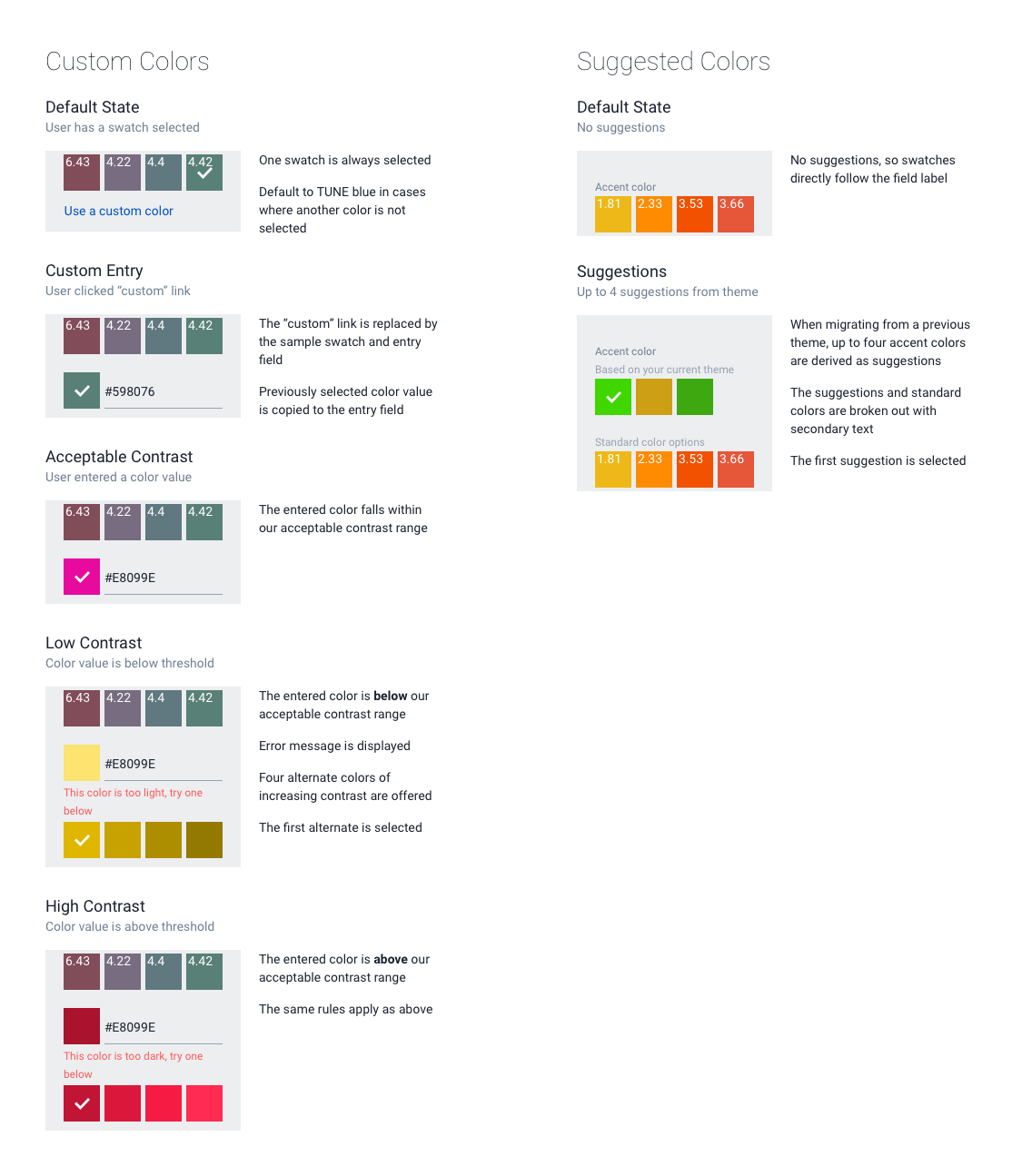
Because this was a migration, I wanted to make it easy for customers who already had some customizations. I designed an algorithm for a palette of suggested colors based on key customization options, color repetition is usage, and adjustment for contrast requirements. I tested many colors to determine our allowable range, and then experimented with edge cases to determine how to darken or lighten a color to balance matching the brand and being usable.
Results
Overall this was one of the longest running projects I have worked on at TUNE due to the migration involved and the many cases of more extreme customization that existed before we started this initiative. I'm happy to say that it went off according to plan, and the feedback was extremely positive. We now have all customers on a consistent, modern experience and have a more stable foundation to continue releasing the features our customers need in a timely manner.
Follow-up
I monitored any complaints or issues that came in over the following months after release. An incredibly small handful of customers had one of two complaints, which were related. One was that since we had moved the navigation from the top to the left side, it was taking up more space than and didn’t provide enough room for some more content-dense pages. The other was that reporting tables were bigger due to larger text and more spacing. The root problem was the same; that they could not see enough data on a small screen.
I updated the style of the side nav so it is collapsed to icons on smaller browser width, and the flyout menu now contains the menu title. I also made the menu full-height for a more consistent feel with a different number of menu items, and added a mask to the page to focus the interaction.
Some of the tables in the app are wide, so I tested a few options to restructure or condense them. The resounding feedback was to reduce the text size. I added zebra-striping, which was also highly welcomed and made it easier for people to track a row across when horizontal scrolling was necessary.
The workflow and interface for the theme customization proved to be useful and usable, and remains unchanged.