Microsoft Adaptive UI
Adaptive UI is a truly scalable system supporting flexibility and evolution of design, which works hand-in-hand with the functional components to ensure consistency, reusability, and accessibility are the default outcome.
Key Takeaways
- Built for advanced accessibility, personalization, and experimentation of visual design
- A true design "system" must be founded on the underlying design decisions
- Working with the decision, not a resultant value, is the only way a system can scale
- Systems reduce arbitrary one-off variations and bugs, especially beneficial for accessibility
I could talk or write about modern design challenges for hours, in fact, I have.
Adaptive UI is a systematic representation of the outcome of the exercise many teams go through when building a design system. The result of most design systems is a fixed and limited set of components, backed by design tokens or equivalently represented visual design values. The process is often very manual and hides a lot of the underlying decisions that were made along the way. It takes a lot of effort to build a solid foundation, and most of the core requirements are the same across many design systems. Adaptive UI provides the design system outcome these teams are looking for, without sacrificing quality and functionality around key principles like accessibility.
This foundational work is not tied to any particular design system representation (including Fluent UI), and may actually be the only "system" any team needs to construct any visual design.
This is just the tip of what is possible here. Any value or treatment you can imagine can be built into the system allowing for that decision to evolve over time, as it surely will. It opens up possibilities for deep individual customization, either for personal preference or accessibility need.
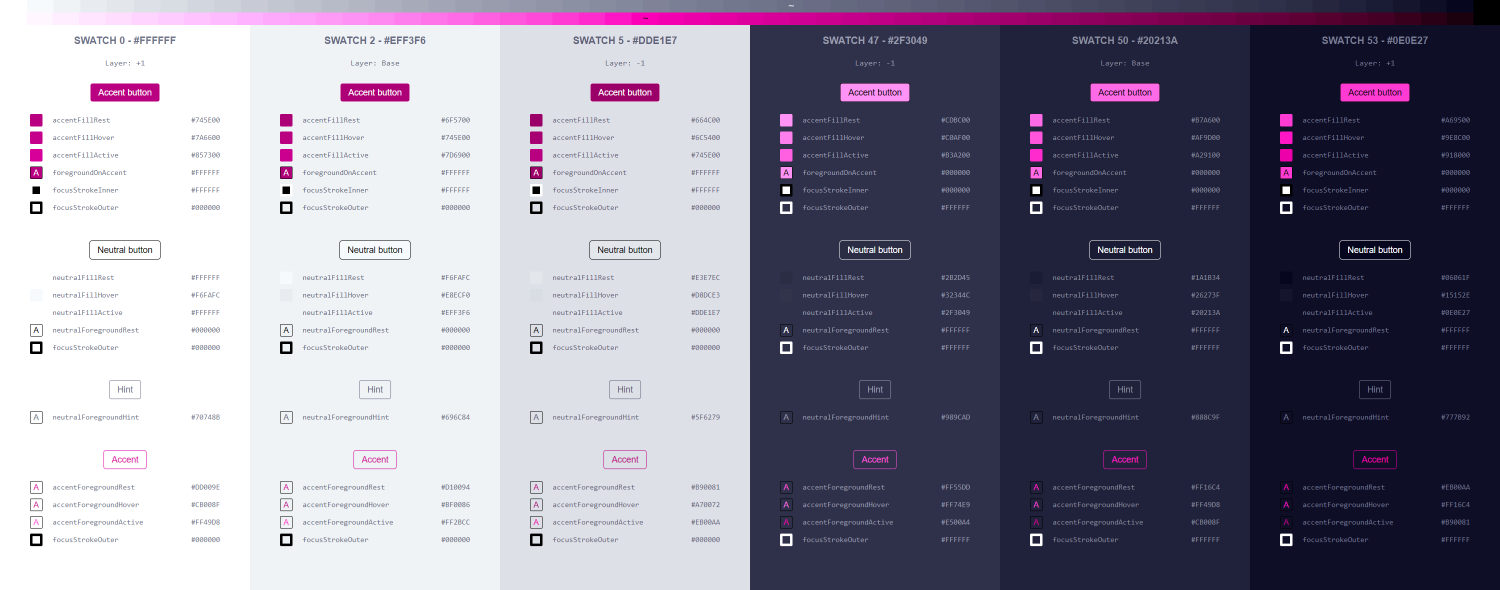
This is a sample of one of the tools I worked on to visualize the effects of adjusting the decisions that are inputs to the color system. The two palettes, neutral and accent, are seen across the top. Those palettes are generated from a base color, then used as inputs to color recipes, which produce specific color values for UI elements. A common recipe pattern is to determine the colors for the rest, hover, and active states for different component types. For instance, an accent-filled button may pick the rest color based on contrast from the containing background color, then the hover and press color as offsets (on the palette) from rest. This results in the common lightening or darkening of a fill on interaction, but it's a true system that works equivalently in any scenario.
Adjusting individual parameters of the color system keeps the UI aligned with the design principles without manually determining what those values should be. For instance, change the base color for a palette and the entire palette updates to reflect that. Change a value representing the relationship between rest and hover and all components assigned that recipe will update. There is no longer a reliance on manually picking colors from a fixed palette and being limited by manually-created palettes and ending up with accessibility violations because the contrast fails. This used to be the most common bug before we incorporated this system into the core components.
Figma components
The primary way designers interact with this system is by building with the Figma components. Every component is built to mimic its functional equivalent to accommodate composition scenarios or styling overrides. All components are built with properties and variants to facilitate interactive prototypes.
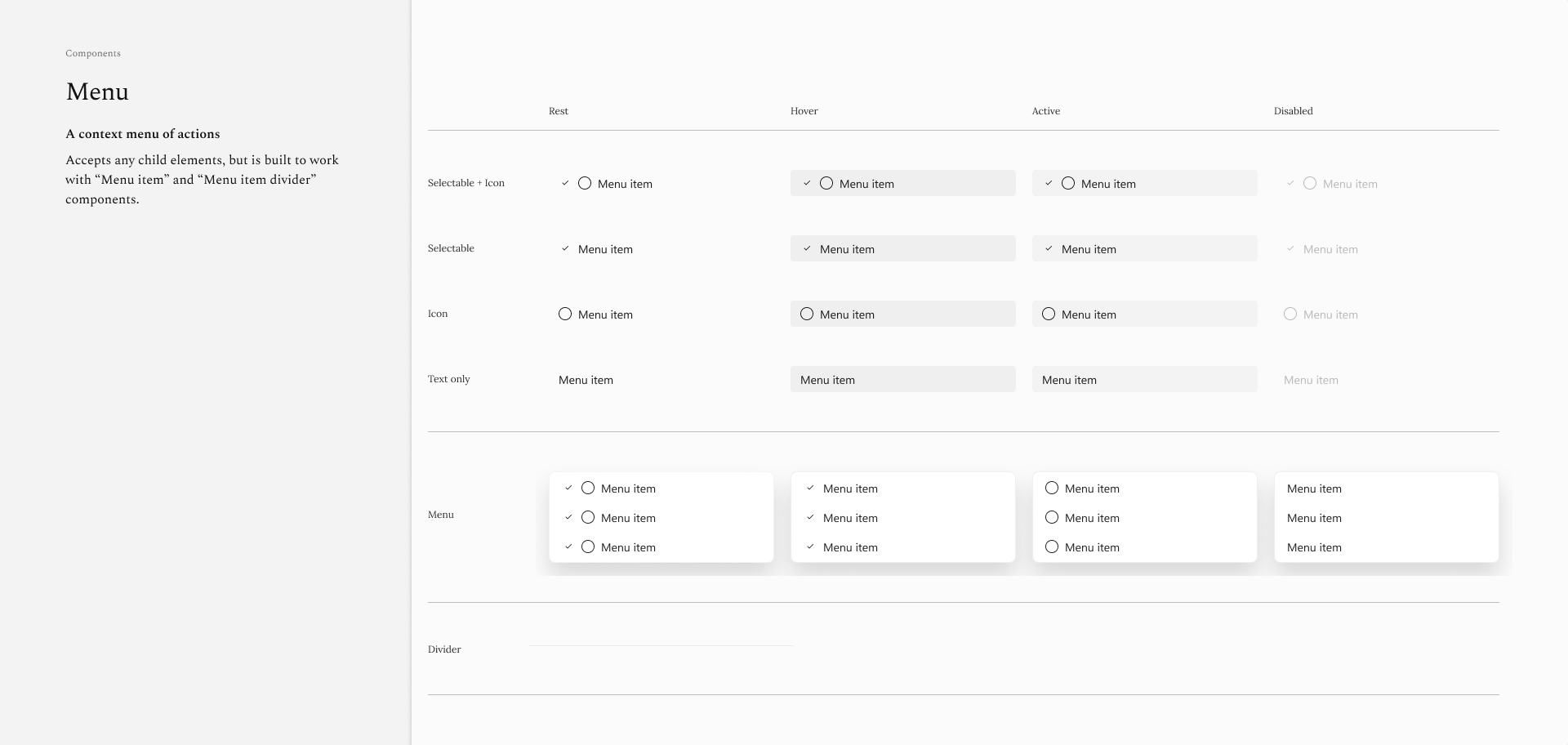
This is an example of the Menu components, including a few common configurations as starters.
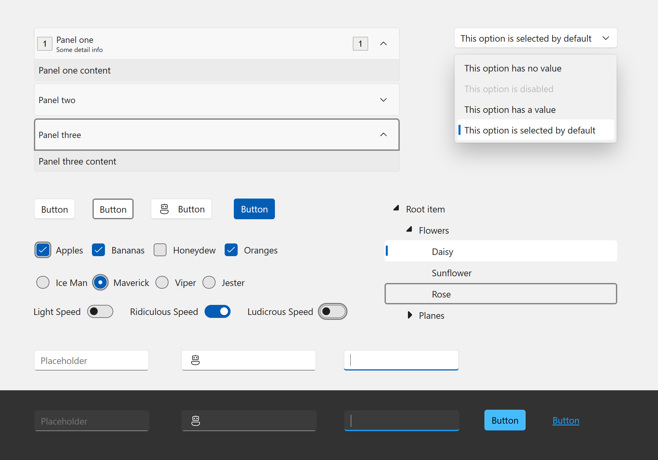
All components are meticulously built for pixel-perfection and extensive customization options for different usage scenarios.
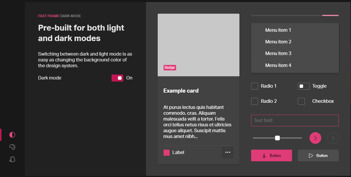
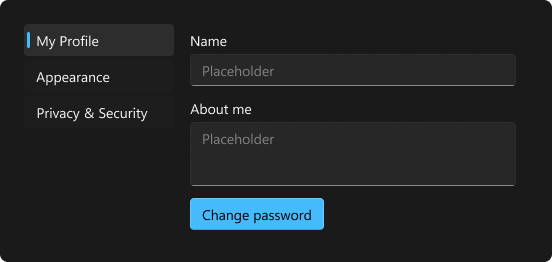
Keep reading to learn more about how the dark mode components illustrated are the same as light mode. No need to build two versions, and never fail contrast requirements or design intention with Adaptive UI.
Figma plugin
Support for Adaptive UI includes a Figma plugin where designers can apply the same recipes inside Figma as in the coded components. All base and custom components are styled with Adaptive UI directly in Figma.
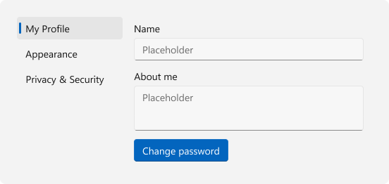
A simple tab navigation form layout using Figma components with Adaptive UI.
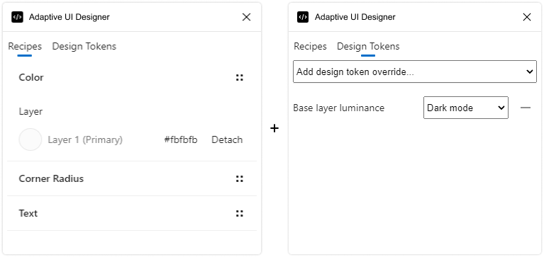
Adjusted to dark mode by setting a “layer background” fill recipe on the container and applying the “Base layer luminance” design token.
The plugin interface simplifies the value, but the luminance is actually a number between 0 and 100 and can easily accommodate darker or lighter "modes".
Results in the Adaptive UI recipes running within Figma and updating the design visuals.
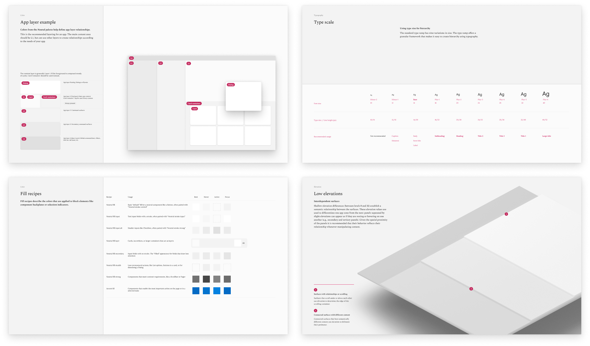
Design System Guidelines
No design system would be complete without guidelines and usage examples. This system was used by a lot of designers across a lot of products, so the focus was on foundational examples that weren't overly strict. The requirement of this system was that it provided the expected and safe outcome by default, but gave the designer the final decision.
Project Details
For this project I designed and built the algorithms and recipes on top of the FAST Design Tokens infrastructure, built the full set of Figma components, and the Figma plugin to apply Adaptive UI values during design time.
FAST In The News: Accessible Adaptive Design Systems with Microsoft's New FAST Framework
Adaptive UI has branched from the underlying FAST Web Component framework. See what we're up to on Adaptive Web Components.
A lot went into this, and there's a ton more that would be difficult to summarize here, but if you're interested in my work I'd love to connect directly to talk about and demo it.